01 — The logo
Always use the official logo files from the Brand page. Don't redraw, outline, stretch, or recolor. Maintain clear space equal to the height of the "H" on all sides. The same marks work for both Homeowner and Pro surfaces.
02 — Moodboard
The imagery Homer lives in — warm homes, honest materials, calm daylight, product in hand. Use these as reference when commissioning photography or building landing pages.
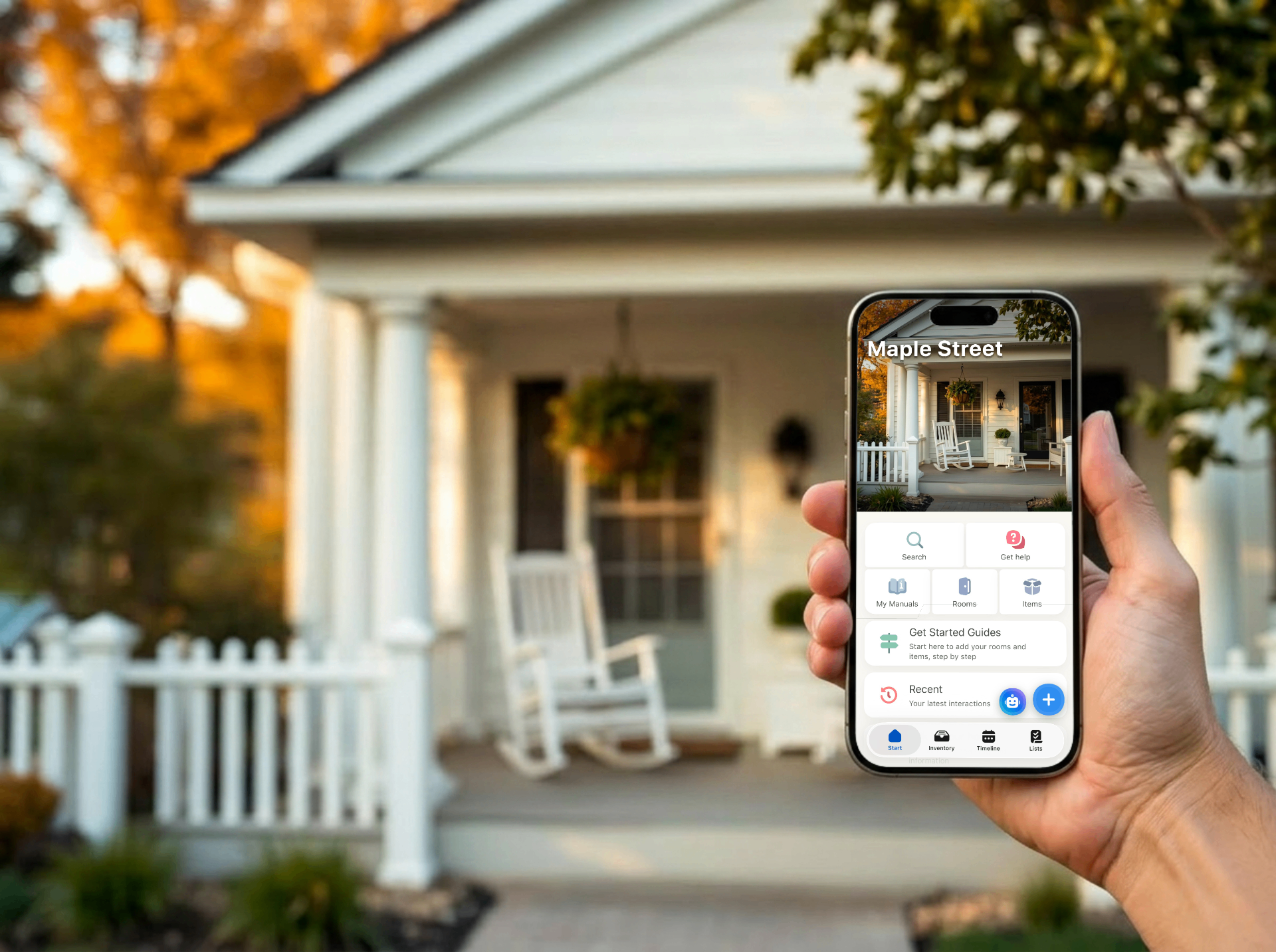
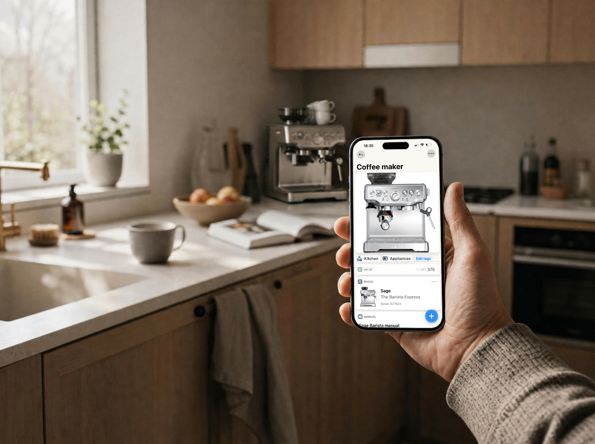


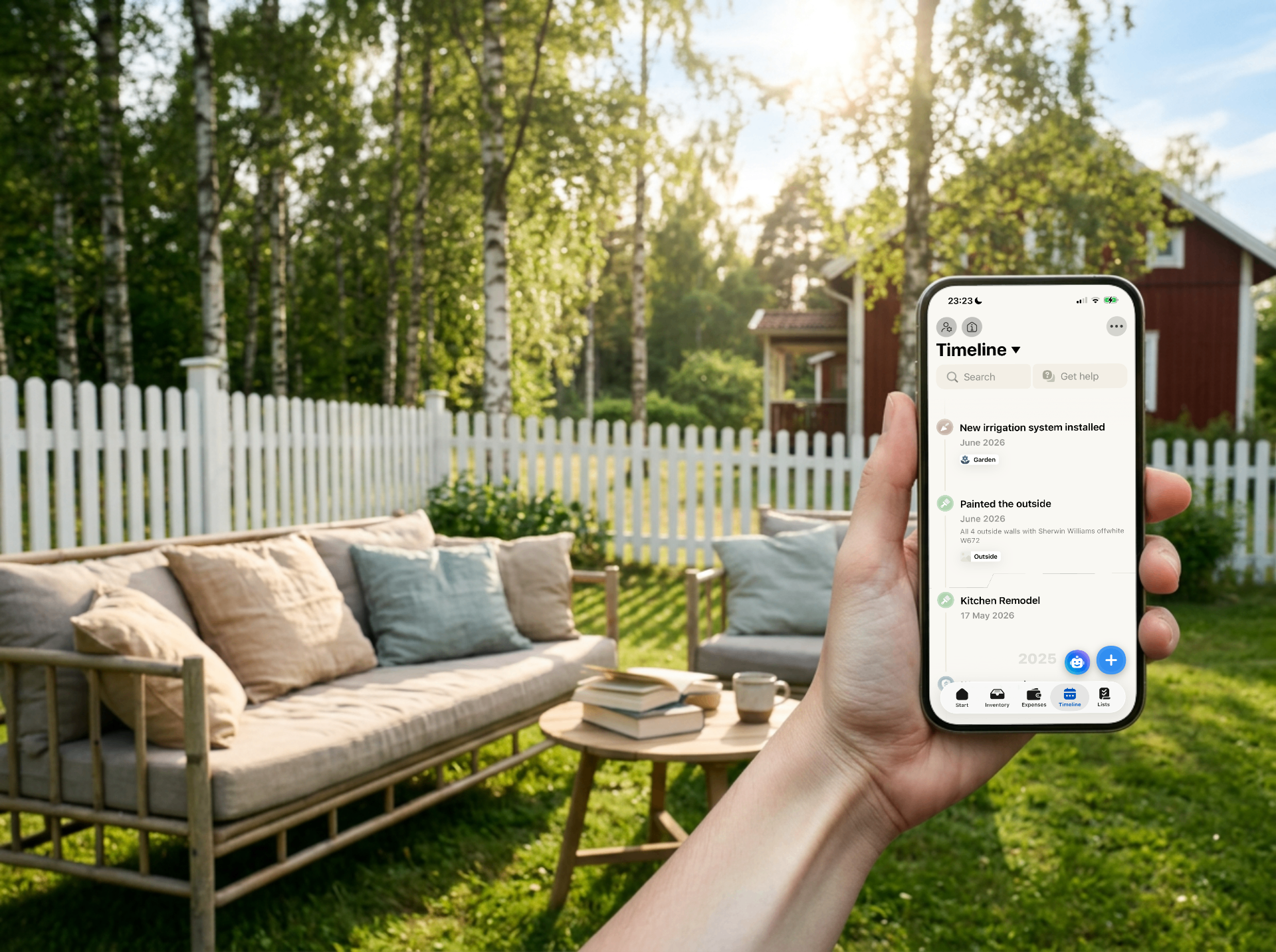
Source: homer.co
03 — Color — Homeowner
Warm, welcoming, human. For anyone who lives in a home.
Lean on Ink and Cream for layouts; bring in Warm Terracotta for emphasis, CTAs, and one-color highlights, and Honey as a supporting accent. Never use Warm Terracotta or Honey as a body-text color.
#D96A3B
#EDAA47
#F7F1E9
#271E17
Rule: don't mix Homeowner and Pro palettes in the same surface. If the surface is for homeowners, use the Homeowner palette; if it's for trades/pros, use the Pro palette.
04 — Typography
Display: Lora. UI/body: IBM Plex Sans. Stick to weights 400, 500, 600. Avoid italics in UI.
Type system is shared across Homeowner and Pro.
05 — Voice
Direct, warm, useful. Short sentences. No hype, no jargon.
- Homeowner: friendly and reassuring — we're a helpful neighbour who's seen this before.
- Pro: peer-to-peer and matter-of-fact — we're a colleague on the job, not a marketer.
06 — Don'ts
- No drop shadows on the logo.
- No gradients on type.
- No emoji in headers.
- No mixing Homeowner and Pro palettes in the same surface.
- No images of unrelated products in Homer-branded ads.
07 — Questions
Internal: ping #brand. Partners: reach the person at Homer who shared this hub with you.